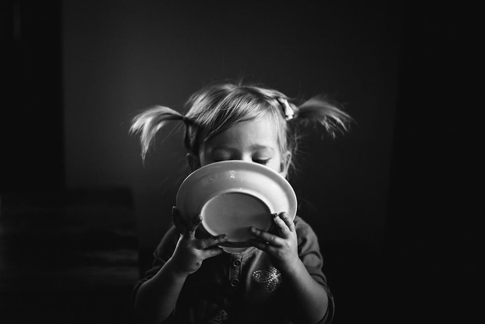
Black and White by Emily Robinson
- Angie Mahlke

- Mar 1, 2020
- 2 min read

I am really drawn to the beauty of black and white photography because of its classic, timeless feel and the drama it can add to an image. Stripping out the colors can lessen distracting elements and bring out interesting details, shapes, and textures, that you would normally not notice in an image with color. When I want to create a B&W image it helps to plan the shot by actually seeing and composing in B&W. Here are a few elements that are important to have in creating a good B&W conversion:
* Contrast - look for good contrast and ponder how it will look when composing.
* Good light - find any light that creates shadows.
* Shapes & patterns - using these will create an abstract quality.
* Texture - using different textures add dimension to an image.

Good light is so important to have - as it creates shadows, and adds contrast to an image. If an image looks drab and gray, chances are that the light and shadow contrast isn’t there for a good conversion. When shooting in dramatic light I tend to underexpose slightly to help maintain detail in the highlighted areas. Once converted, the background can fall into shadow and even completely disappear which brings attention to your subject and the emotion in an image.

In Lightroom I start by using a custom preset and then adjust the sliders and tone curve from there. Typically I start by pulling down the exposure just a bit and bringing up the highlights to help create more contrast, set both the contrast and clarity between 25-50, lighten the shadows and maybe deepen the blacks a little. In the tone curve module I lighten the darks and deepen the shadows (this helps give a “pop” to the image). I use the orange luminance slider to brighten the skin tone until it looks right and the temperature slider as well (making image cooler or warmer can change the image quite a bit so just play around with it until it looks right). Once I get everything where I want it I’ll go back with the radial filter to add extra clarity where I’d like the texture to stand out.


Beautiful images!