Black and White by Rachel Keohane
- Angie Mahlke

- Mar 4, 2020
- 2 min read

I have always been drawn to black and white photography. When I was little, my dad had Ansel Adams prints in his house. I would find myself staring at these pictures in awe of their beauty. That adoration of black and white photography carried over with me as I began my photography journey.
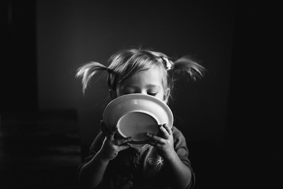
Almost every picture I take, I imagine how it would look in black and white first, then color. Black and white photography conveys such emotion and drama. They are timeless. They can also give a more artistic look to an otherwise simple capture.

On all my bnw edits, I only use 2 presets in Lightroom. One is from Tribearchipelago, LXCN collection and the other is from Pretty Presets, Harvest Moon (my main go to). After applying either preset I always adjust the image further. I always bump up the clarity, sharpness and contrast. I usually bring down the highlights in the image to keep any light from looking blown out. Depending on the image, I will adjust the shadows slightly. I truly feel that playing around with contrast in a black and white image is important. Unlike in a color picture, you don’t have different colors and tones to distinguish objects or subjects from another in a photo. Adjusting your contrast will help your main subjects or objects stand out in the image.
When deciding to edit in color or bnw I try to see what I’m wanting to portray in my photo. If I’m wanting a more dramatic or emotional portrayal of an image, I will edit in black and white. Every once in a while I will edit in bnw to cover a mistake I made with lighting or focus if it’s an image I can’t get myself to scrap.
There’s a quote I love about black and white photography and there is such truth to it.
“When you photography people in color, you photograph their clothes. But when you photograph people in black and white, you photograph their souls” -Ted Grant


Comments